Document Actions


Interface Document Updated
As the devs are still working on improving the interface, some changes have been made since I posted the document presenting the improvements two weeks ago.
- Two changes are added (6. and 7. of the document):
- In the Player window, the bonus/malus icons and current/next action boxes will move out of the window and added to new windows;
- Some of the window names are renamed for a better coherence.
- A few changes are being made for the Chat window too:
- An option is added, allowing to display the tabs of every channels;
- The chat commands with two lettters remain (/gu, /sh, /re, /te).
In order of importance, here are the changes applied to the interface.
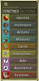
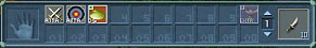
1. The Windows bar
We want the windows bar to become more functional and to visually look more like a task bar. In the new version, the size is reduced, and the repartition of the different windows and actions to which it gives access is more logical.
3 modes are included: a text mode, and two icons modes.
- Text mode (image A):
- In text mode, each button is colorized to correspond to the colour of the icon;
- There are 2 tabs (instead of 3) with a reorganized content: windows and actions;
- The tooltip associated to each button displays the hotkey corresponding to the opening of the window (for example: Inventory (i) next to the inventory button). - 1st Icons mode (image B):
This is the mirror of the text mode, without the texts near the icons. It directly shows the two 9-icons columns (windows and actions). - 2nd Icons mode (image C):
It follows the principle of the 1st icons mode, but only with the windows column.
 |
||
| Image A – Text mode | Image B – Icons mode 1 | Image C – Icons mode 2 |
2. Chat
We wish to improve the Chat window, by making its use simpler. The emotes menu is linked to this window.
- The User Chat
- It becomes the default Chat (It will not be the Around Chat anymore);
- The button enabling to switch modes now automatically changes when we use a command alone (like “/say”);
- This button displays a menu listing the different channels with their hotkeys (for instance: “Around /say”);
- When we write in a Chat channel, the colour of the keyboarded text becomes the same as the colour of the channel (for example: the Region channel is blue; when we begin to write in region mode, the keyboarded text will be blue);
- When the filters are applied in the User Chat, the filtered tabs or windows are not displayed any longer (Around, Region, Team, Guild).
- *added* An option allowing to display the tabs of every channels is added, for those who prefer to see them (as it is now);
- *updated* Chat hotkeys change, with only one letter instead of two. The 2-letter commands will remain (/gu, /sh, /re, /te). Here is the list of hotkeys:
- /g to talk in “Guild”
/p to talk in “Team”
/r to talk in “Region”
/s to talk in “Around”
/t to talk to somebody (tell)
/y to shout - Emotes
- The “Emotes” option from the contextual menu (which appears when we right-click) disappears to be replaced by a button in the Chat window;
- This button displays a menu with 10 common emotes (wave, bow, courtly, hiha, thankful, cheer, silly, dance, dramatic, heroic), and with another button to open a sub-menu with all the others.
- *added* A button "Quick Chat" is added under that list, and will open a menu showing the quick chats and their shortcut, which already exist in game.
3. Texts of the System Info window
We wish to reduce the use of the System Info window. To do so, all the important information feedbacks will become directly visible in the scene. The window will then mainly be used as a fighting log and will not be open all the time.
As a consequence:
- - The welcome message (MOTD) is displayed in the “Around” chat;
- For fighting, the messages “miss”, “break” and “resist” are displayed in flying texts.
We also bring a few corrections to these points:
- - Error messages at the top of the screen: fight messages (“your target is too far away”, “not enough sap points”…) are written in yellow for better visibility; other written messages remain orange;
- The flying texts scrolling during fights to indicate “dodge” or “parry” actions, and “critical hit” are corrected, so that they are displayed even when there are two of them in a row.
4. Tooltips
The tooltips are a good means to get information about an element on the screen, for it is a direct help. We have already started to introduce this help system by making the displaying of the tooltips instantaneous, and by incorporating a richer text (several lines, coloured).
In the long run, we would like to completely replace the current help system on the windows (accessible via the “?”) by this tooltips system.
A few examples of tooltips that were added and modified:- - Chat and “Inventory” windows: a tooltip on the tabs tells you that a right-click on them makes the windows linked to these tabs pop up;
- “Inventory” window: a tooltip about the filters indicates that right-clicking on it activates only this filter;
- “Identity” window: the tooltips explaining dodge and parry are contextual. For instance, in the case of dodge:
- 20% chance of dodging an enemy of level 10.
- “Target” window: the level of the targeted creature is directly indicated by the tooltip instead of a long text explaining the colour and star system (as is the case now). For instance:
- Creature of level 1-10.
5. Default Interface
Here, we have revised the position and behaviour of the windows when you arrive in the game with a new character and open a window for the first time, the position of the actions and the object that is held depending on the packs that were chosen during the character creation, and the shortcuts.
- Position of the default windows:
- The size of the Chat Window is bigger (more lines are displayed);
- The “System Info” window is directly integrated into the Chat Window (note: it will thus only have two tabs in the final version: User Chat and System Info);
- The Windows bar takes less space and is in the corner;
- *added* The "Target" window is under the "Player" window, instead of being on the top-right corner.
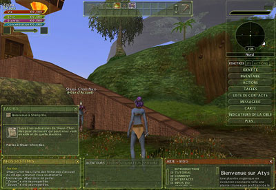
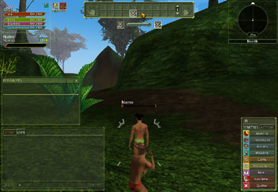
On the right: new disposition of the windows.
- Transparency of default windows:
- The “Player Gauge”, “Target” and “Compass” windows keep their 100% transparent background;
- The Chat Windows, “Tasks”, “Help” and “Map” have a 60% transparent background (because they are big, and likely to be open often and/or always);
- The other windows (“Action Bar”, “Inventory”…) will not be transparent, and will not fade when running the mouse on it. - Opening position of default windows:
- They open in the middle (they currently open in the bottom left corner);
- Exception: the windows “Map” and “Contact list” open under the compass, at the top right corner, because they are likely to be opened quite often. - Position of actions and tools at the beginning:
- In the action bar, the enchantment action is removed (useless at this point);
- The fighting actions are placed on the left (melee first, then magic);
- Foraging and crafting actions appear on the right.
- The object held in hand by default, when you arrive in the game the first time, is the weapon, instead of the pick (if a fighting pack was chosen). The foraging tool might indeed hamper the fighters which consequently cannot fight from the start.
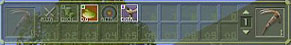
On the right: new disposition of start actions.
- Hotkeys:
- We have tried to reduce the number of one-key hotkeys, to avoid closing windows when you type its hotkey unintentionally. Some of them are thus transformed into a combination of keys with [shift], and the window hotkeys that do not need to be opened/closed very often are simply suppressed. They are still configurable via the keys configuration window.
In detail (changes are in white):
Action Book B Animals Shift+P Compass N/A Contact List F Encyclopedia SHIFT+E Fame SHIFT+F Global Settings N/A Guild G Hands N/A Inventory I Journal J Keys N/A Macros N/A Main Chat N/A Map M Player N/A Status (Identity) P System Info N/A Target N/A Team List Y Connection SHIFT+N Guild Forums SHIFT+G *new* MP3 Player N/A *new* Active Links N/A *new* Mailbox SHIFT+M *new*
6. Player window
This window, currently mainly displaying the 4 energy bars, current/next actions and bonus/malus, is modified to take less room.
- Bonus/Malus:
The part displaying bonus and malus is separated in a new transparent window, movable anywhere. The current system of icons appearing/disappearing is kept, and 2 icons are added there:
- The line showing the activated XP catalyzers becomes an icon with the stack quality indicated on it, and the quantity below.
- The timer of the Outposts PvP, informing the time remaining before the end of a round, as well as the time before the PvP deactivation, also becomes an icon. The timer is then displayed below.
- Current/Next actions:
This part is also moving out of the player window, to appear under the Actions bar. When no action is activated, this Current/Next actions bar remain invisible. It appears only when using an action (under the Actions bar if it's at the top of the screen, above the bar if it's at the bottom).
An option is added to select the old or new version of the Current/Next actions location.
7. Windows name
Some names of windows are changed, for a better coherence. For example, the "Tasks" window becomes the "Missions" window.